15 logo colour combinations to make your logo stand out
Creating the perfect logo for your brand can be one of the most challenging early tasks for a new business. And no stage of that process is more difficult than choosing the logo colour combinations that will define your brand identity for years to come. Thankfully, you need to scroll the internet no further, as we’re here to provide you with everything you need to know about choosing the right colours for your logo design.
When should I start looking at the colour of my logo?
Firstly, you should consider what type of logo you want, such as whether you want a logotype or logomark. Once you’ve briefed the logo designer with this, then it’s time to start working on concepts. It may sound counter-intuitive, but our recommendation is to always start creating logo concepts with your graphic designer in black and white before you start considering colours. Why? Looking at concepts in black and white allows you to interpret the design of the concepts for what they are, rather than which colour you prefer.
By using this method, you focus on the elements of your logo with far more precision than you would with colour. How does the logo design tell the story of your brand? What message does it convey to potential customers? These are all essential elements that shouldn’t be clouded by colour. Once you’re happy with a concept, it’s time to start thinking about your logo colour combination.
What are logo colour combinations?
This might sound like a stupid question, but hear us out. We’re sure you know what a colour combination is, but do you know the different types of logo colour combinations you should be considering? The best way to start is by looking at the colour theory wheel.

Within the colour wheel, there are 4 styles of colour combinations; Monochromatic, Analogous, Complementary and Triadic. Each of these combinations has its own merit for logo design, so it’s an important starting point on your colour choosing journey.
As you can see from the image above, monochromatic colour combinations use different shades of the same colour. So, for example in the monochromatic wheel above, we have a number of different shades of yellow. It might sound boring to limit yourself to one colour, but this can be used to add depth, as well as give your logo a contemporary and minimalist look.
Analogous logo colour combinations range from 2 to 5 colours that sit alongside each other within the colour wheel. In the example above, you can see that we’ve chosen the 3 colours yellow, orange and red. The idea of using these combinations is to create a harmonious balance where one colour can often dominate whilst the other colours provide a supporting role.
On the other hand, complementary colour combinations take colours from either end of the colour wheel. This provides two colours that can create sharp lines and high contrast alongside each other. These can be very effective if you’re looking for a high impact colour combination that catches the eye.
Finally, triadic combinations are created by drawing a triangle in the centre of the colour wheel. At each point of the triangle, take a colour to give yourself a dynamic 3-colour palette. Triadic logos are similar to complementary colours, but they have 3 contrasting colours instead of 2. Look at brands such as Burger King as an example of a triadic logo colour combination.
Why is logo colour important?
Different colours evoke different emotions in people. You want to evoke an emotion that is representative of the emotion that your brand is trying to achieve. Research your customer profiles, look at competitors in your industry, and deeply consider the type of brand identity that you want to achieve.
These are crucial considerations to take into account before diving into a colour scheme that you’re stuck with for years to come – unless you’ve got the budget for an immediate rebrand.
15 logo colour combinations
Sometimes we associate colour combinations with specific sectors which can help identify what industry a logo belongs to. You might decide that you want to use this as a foundation for your own colour combination, or equally, you might decide to go against the status quo if you see yourself as a disruptor of your industry. See if you can identify which industries these examples typically belong to.
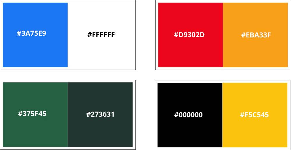
1. Blue & White
Sector: Technology
On the top left is Facebook’s brand colours, which are very similar to many other tech brands including the likes of Skype, Twitter and Samsung. Blue is the prominent colour with white playing the supportive role for all of these brands and is said to evoke stability, trust and security.
2. Red & Orange
Sector: Finance
Next up we have Mastercard’s analogous brand colours. This set of colours is prominently used by brands in the financial services sector including the likes of Monzo, HSBC and Santander. Red as a brand colour suggests power and authority.
3. Green & Emerald
Sector: Food & Drink
This combination is classically used by brands in the food & beverage sector. The colours we’ve shared above are Starbucks’ brand colours. However, you can also see similar colour combinations used by Subway, Heineken and Whole Foods. The colour green represents natural products and this might explain why it’s favoured by many brands in this industry.
4. Black & Yellow
Sector: Industrial
This is a classic combination for industrial brands. Think Caterpillar (CAT), JCB and Stanley as three huge players in this sector that all use this logo colour combination. A lot of industrial signage is created in black and yellow which explains why the choice was natural for these global powerhouses.
Logo colour combinations and brand personality
Your logo colour combination gives customers an insight into your brand personality before they know anything else about your brand or business. Below we’ve provided 10 examples of colour combinations and the brand personality traits they can imply.
5. Red & Navy
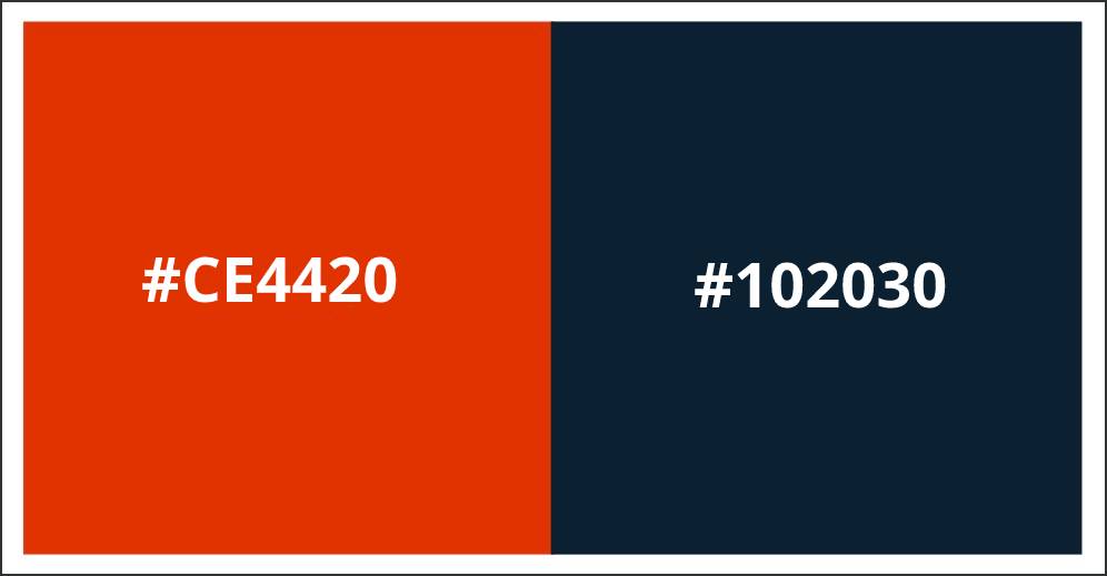
Personality: energetic, provocative, attention-grabbing
Red and navy is a colour combination using the complementary colour wheel. Red and blue is the classic contrasting colour scheme. The dark shades of primary colours merge into a bold colour combination. The red brings the energy and the blue makes the red pop with sharp lines.
6. Blackcurrant & Light Blue
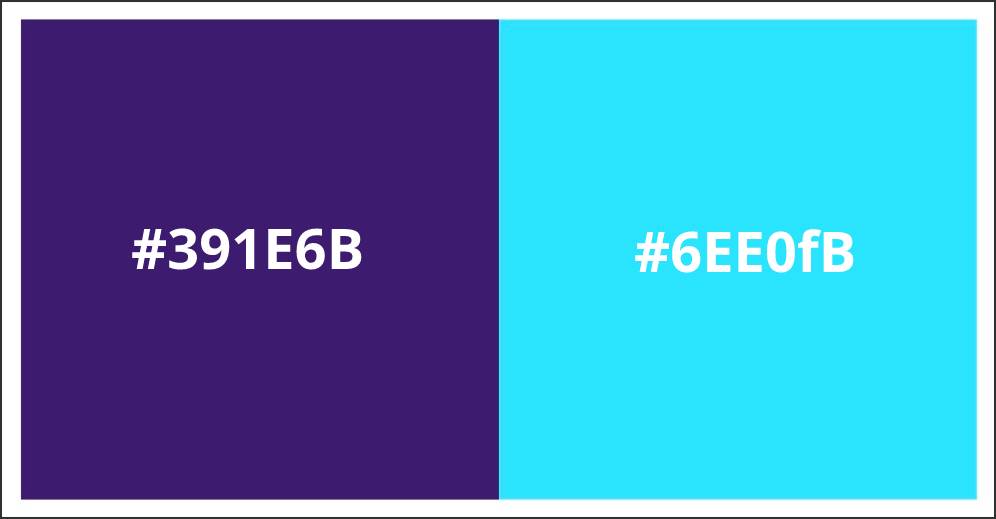
Personality: royalty, sophistication, nostalgia, mystery, spirituality
Using the analogous colour theory wheel, this combination brings a regal element to a logo. Analogous colours work great with logos, icons and infographics as they are pleasing to the eye. This mystical colour combination is great for any spiritual brand but it doesn’t stop there. It‘s also commonly used for tech businesses dealing with media and communications.
7. Blue & Pastel Pink
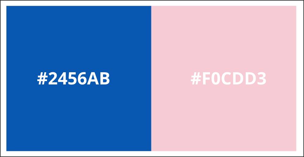
Personality: trustworthy, dependable, secure, responsible, confident
The blues and pinks in this colour combination will work well as contrasting backgrounds with whites and blacks as contrasting text. Blue doesn’t have to be for boys and pink doesn’t have to be for girls. Pair them together for a confident colour combination that has no boundaries.
8. Lime Green & Emerald
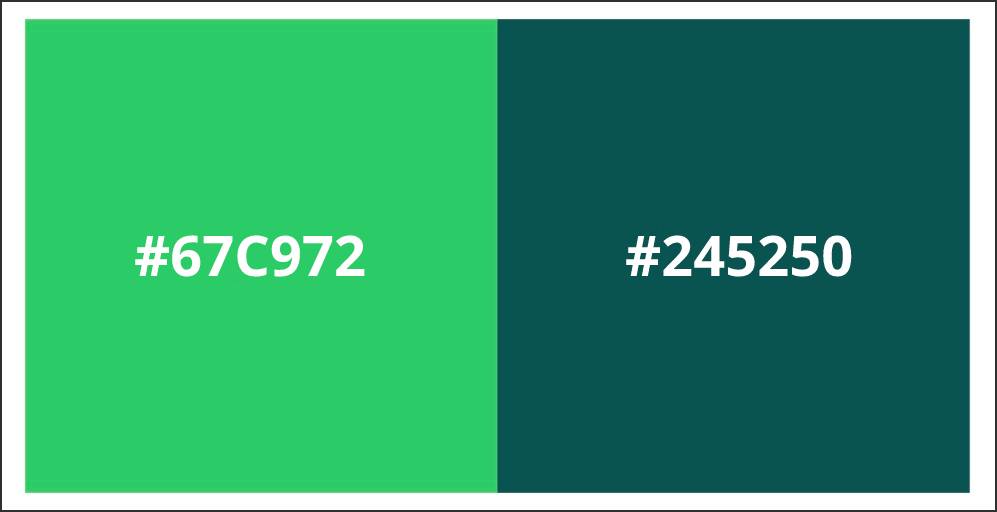
Personality: wealth, health, prestige, serenity, generosity, nature
The greens in this combination complement each other whilst the dark and light colours bring a nice contrast. This green colour palette is reminiscent of nature. The darker green shows wealth and by pairing it with this lighter green, your logo will be kept cool and fresh.
9. Light purple, Mint & Yellow
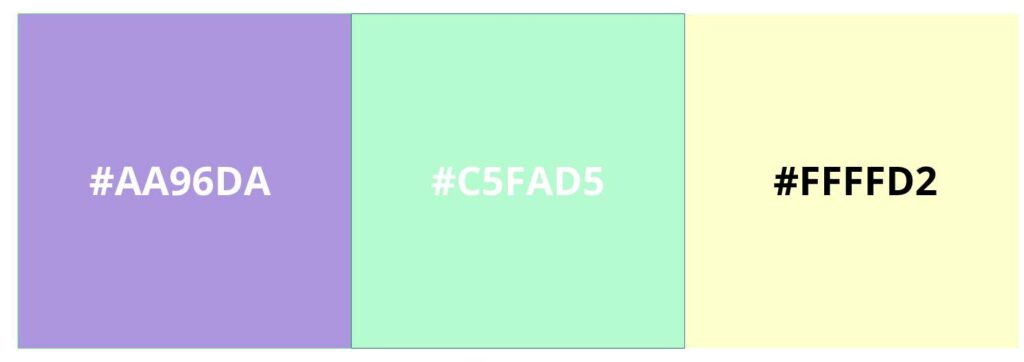
Personality: positivity, light, warmth, motivation, creativity, happiness
These colours are an example of a triadic logo colour combination. They work together to create a soft and tranquil brand. The lavender purple and yellow are tried and tested, whilst the green accent adds the perfect flair. If you want a stunning pastel logo that is spring-inspired, then this might just be perfect for you!
10. Orange & Peach
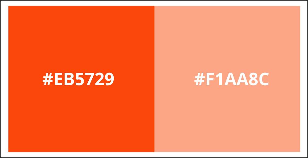
Personality: vitality, fun, playful, exuberant, outgoing
A punchy monochromatic colour combination for an exuberant and cheeky brand that doesn’t take itself too seriously. If you don’t want to use multiple colours, using different tones of the same colour is a great way to add depth. Be playful and add this colour combination to branding assets such as icons and photography.
11. Earthy Brown & Light Brown
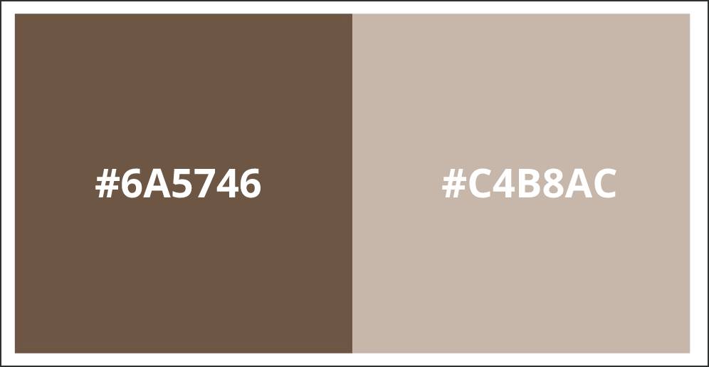
Personality: earth-like, natural, simplistic, durable, comforting
The brown tones in this combination are similar shades but they’re far enough apart on the colour theory wheel to look like different colours to add balance to the colour combination. Brown isn’t the most used colour in branding but can be great for coffee brands or natural products. Though these colours on their own might be plain and boring, together they create an inviting, warm feeling.
12. Black & Gold
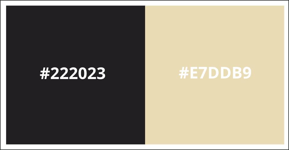
Personality: Prestige, value, timelessness, sophistication, power
Want a colour combo that creates a powerful, but classy brand? There’s no better colour to represent power and sophistication than black. Pair it with a gold like this one and you have yourself a timeless brand. Great for clothing and jewellery brands.
13. White & Grey
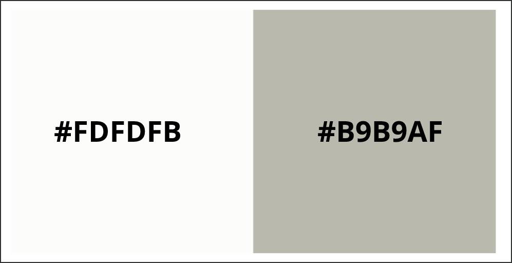
Personality: pure, noble, clean, soft
Guess what, your logo doesn’t always have to be bright and loud. Keep it clean and classy with shades of white. Too much white can be sterile though, so we’ve paired it with a darker shade of grey for this combination to provide depth and texture.
14. Navy, Red & Yellow
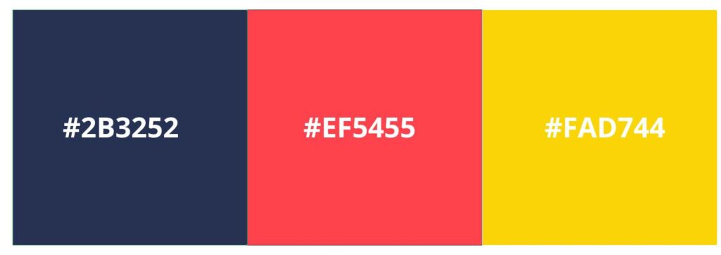
Personality: energetic, powerful, confident, loud
If you want a bold and powerful triadic logo colour combination, then this might just fit the bill. The bright red and yellow colours give off the aura of a confident brand, and the subtle navy adds depth to the composition.
15. Pink & Navy
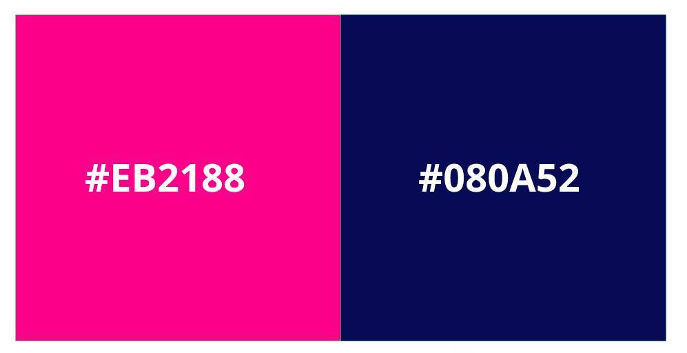
Personality: electric, active, dynamic, bold
These 2 colours really work hard together to accentuate each other. The dark navy makes the pink pop and catch the eye, which is great if you’re looking for a dynamic and bold colour scheme. Think professionalism meets contemporary.
So there you have it, 15 logo colour combinations for you to consider. We hope that this article has helped you in your branding journey. Even if none of these colours is quite right for you, hopefully, you should now have a better understanding of what you’re looking for.


