How to design a logo: the simple guide
When it comes to designing a good logo, there’s a lot to consider. That’s why we’ve put together a simple step-by-step guide on how to design a logo that’s fitting for your business.
- Decide on your goals
First thing’s first, decide what you want to achieve from your logo. Maybe you’re looking to increase awareness of your business, or perhaps you want to further establish your brand identity. Whatever your goals might be, note them down and start thinking about which ones are a priority.
Logos are great for grabbing attention and helping to aid recall, which could be one of your goals. In today’s society, attention spans are short — very short. That’s why having a unique logo can really help to secure the attention of potential customers. In fact, research shows that humans learn more from visual cues than words.
People don’t necessarily have the time to stop and read your company values as they walk or scroll past. So having a good logo that visually represents your brand is the best way of capturing that short span of attention.
- Consolidate your brand identity and USPs
No matter what logo design you go for, it needs to reflect your brand identity. Whether you’re a well-established business or one that is just starting up, take a step back and think about who you truly are as a brand.
What are your company’s most recognisable features? What makes you different from competitors in your industry? What unique selling points does your business have? These are the type of questions that you should aim to answer through your visual logo. Having this strong brand identity in place will make it easier to decide on colours, styles and typography later down the line.
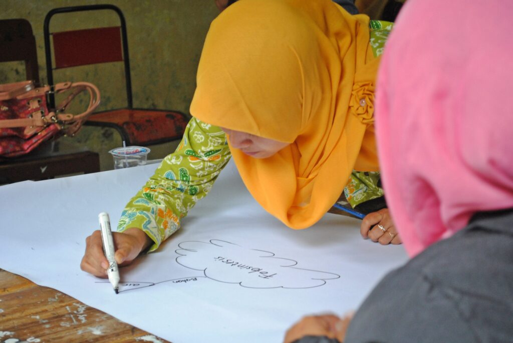
Mind mapping can be a great method for brainstorming ideas. Start with your business as the central idea and draw related words, phrases or images around it. Another interesting technique is to see if you can describe your business in just three words. This might be tricky, but it’s a great way of working out the most important elements that make up your company.
- Think about your target audience
Your logo will need to appeal to the right people, known as your target audience. By fully understanding which type of people are in the market for your product or service, you’ll be able to create a logo that they will engage with. You’ll need to pick colours, images and fonts that will connect with them and encourage those important people to convert their interest into sales. Remember that different styles of logos work well for different types of products and services. For example, vintage logos can be great for conveying a sense of authenticity and heritage, whereas animated logos can support more innovative and energetic brands.
If you’d like to spend more time getting to know your target audience, there are a few key techniques you can use. Firstly, start with taking a look through Google Analytics, which provides key data on your audience, including their demographics and preferred online channels. You can take this a step further by carrying out customer research on their likes and dislikes. Have a look at their social media, read any reviews they have left and search for online forums related to your industry.
- Decide on colours and style
Now we get to the exciting part. When it comes to actually designing your logo, there can be a lot to consider. Sometimes the hardest part is deciding which of the many colours and fonts you should opt for! Just remember to always keep your target audience in mind and pick a design that they’ll hopefully engage with.
Choosing your key colours for the logo can be a good place to start. Each colour has plenty of associated meanings and also some psychological effects too. These include:
Brown — a tone that is associated with earth and natural ingredients. It has a very “outdoorsy” feel but also brings a sense of trust and seriousness.
Green — this colour brings connotations of organicness, sustainability, eco-awareness and gardens. It’s a calming colour that suggests balance and growth.

Red — this fiery colour is full of enthusiasm and boldness. If you’re looking to stand out from the crowd, this could be the colour for you. It conveys confidence, passion and romance too.

Blue — this peaceful tone creates feelings of relaxation, trust and loyalty. It also has strong links to healthcare and spirituality.

Orange — this is generally seen to be a fun and exciting colour. It has connotations of summer and energy, and is good for younger demographics.
Pink — pink tones are generally still associated with femininity. This colour has links to kindness, love and playfulness.
- Decide on typography
Whilst colours are important, typography is an element that shouldn’t be underestimated. You’ll want to pick a font that is eye-catching, reflects your brand identity, engages your target audience, and is easy to read. Plus, just like colours, fonts can also have a psychological effect, provoking different emotions.
Perhaps a quirky, bold font would represent your business best, or maybe an elegant, formal style is more suited. There are plenty of different fonts and typefaces available, so make sure you have a good look at all options.
There are six standard font classifications, which make a good starting point for typography research. These are:
- Serif — classic, traditional, evoking feelings of trust
- Sans-serif — simple, minimalistic, bringing a sense of cleanliness
- Slab serif — bold, loud, creating a quirky feel
- Script — elegant, unique and decorative
- Handwritten — informal, playful and approachable
- Decorative — distinctive, highly decorative and powerful
- Get sketching (and find a graphic designer)
Now it’s time to combine all the above steps together and start sketching out how you’d like your logo to look. This is where you can start to use the words and images which you jotted down when mind mapping your brand’s identity.
Not every logo needs to include an image. Instead, you could opt for a word-driven design or something conceptually simple. A “wordmark” logo is a simplistic design that only uses the business name rather than additional symbols or images. With this type of logo, colours and fonts are used to create something memorable and creative. At the other end of the spectrum, abstract/symbolic logos focus on the use of unique symbols to represent a brand.
Once you have your rough designs ready, why not speak to a freelance graphic designer who can help to bring your ideas to life? Graphic designers use their expertise to craft aesthetically pleasing logos that represent brands in an engaging and appropriate way.
So what are you waiting for? Make your ideas happen today.